
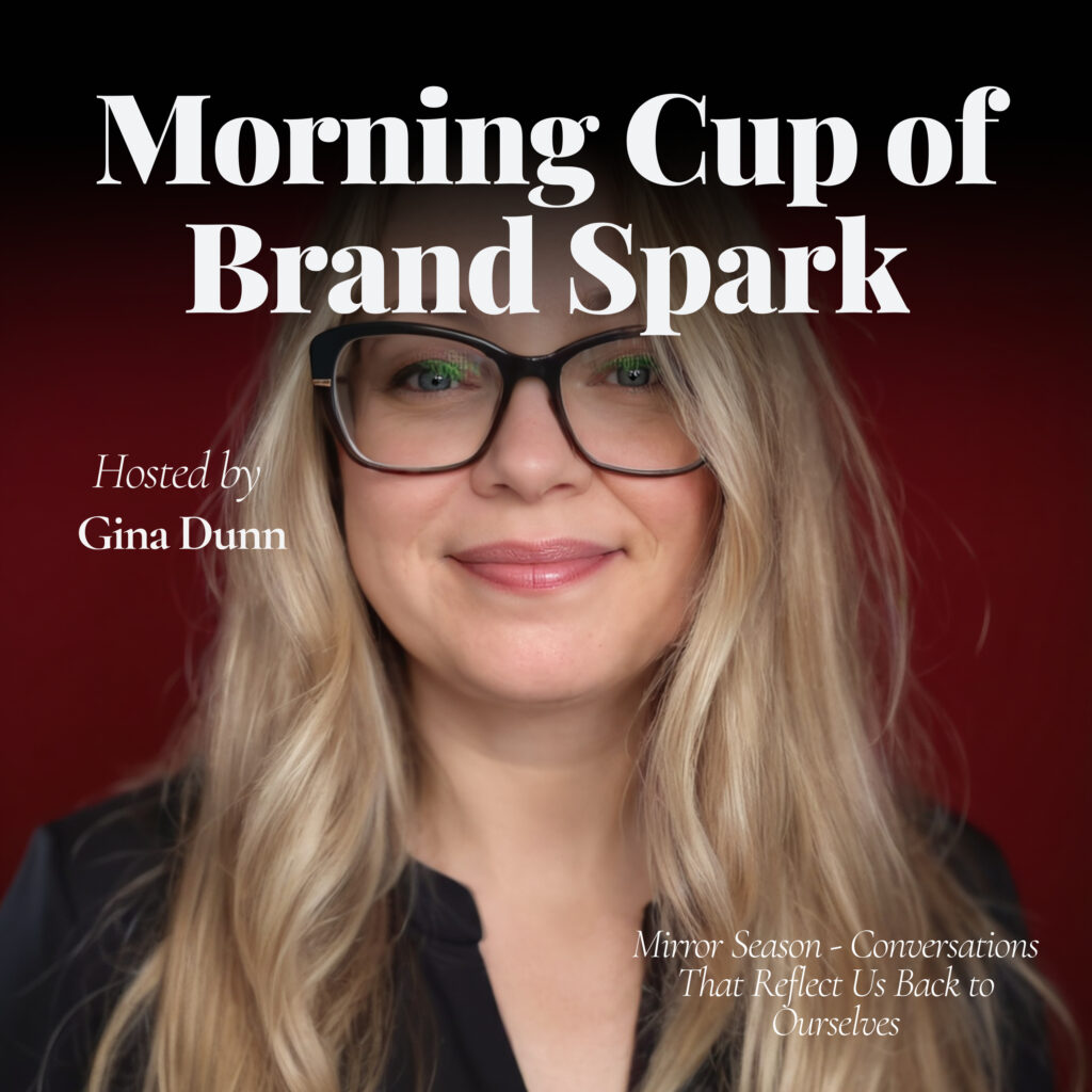
Stop Hiding Behind Your Logo – Ep 3 April 30, 2025
Pretty branding won’t save a messy message. Today we’re breaking down why your visuals aren’t the real problem — and what you should focus on first if you actually want your brand to stick. (Spoiler: it’s not your fonts.)
Discover more:
👉 Take the Brand Glow-Up Audit Toolkit — and get clarity on what’s working, what’s not, and what to fix first. [click here]
🧠 Find your biggest brand gap: What’s Your Brand Blocker? Quiz — fast, free, freakishly accurate. [click here]
🎙️ Like spicy marketing convos with AI + bold branding? Tune into my video podcast with Natalie: BrandedAF → [click here]
📬 Get my juiciest takes every month in the Brandology LinkedIn Newsletter — follow here → [click here]
💬 DM me your spark from today’s episode — I read every single one. Seriously.
🤝 Let’s connect on LinkedIn — drop me a note and tell me what you’re building → [click here]
🚨 Feeling stuck or scattered? Book a 1:1 Clarity Call with me — we’ll find your brand’s backbone and make it work smarter. [click here]
"A strong brand can survive bad visuals. But a beautiful brand cannot survive bad strategy. Period. Point blank."
Full transcript
Alright, welcome back to Morning Cup of BrandSpark, your daily shot of brand strategy to wake up your business faster than that second espresso. maybe my third. I'm Gina Dunn, founder of OG Solutions, and today I'm coming for the thing that you think is actually saving your brand. But honestly, it's just a very expensive distraction to you. So let's light it up.
Okay, this one might hurt a little bit, but it's the good kind of hurt, I promise. It's like a deep tissue massage that pops your shoulder back in where it belongs. Are you ready? Your logo is not your brand. Your colors are not your brand. Your aesthetic, it's definitely not your brand. Let that sink in for a minute. If you spent the last two weeks picking out new hex color codes, maybe you swapped out stock photos on your website, or you're obsessed over which of your font feels more edgy than the other. You know what, you're rearranging the throw pillows on a house that has no walls. Here's the spark for today. Design doesn't save a weak brand. Design amplifies a strong brand. Let me say that again for the founders in the back who are posting mood boards on Pinterest, like it's your full-time jobs. Design doesn't save a weak brand. Design amplifies a strong one. If the foundation isn't strong, your positioning, your voice, your point of view, then no amount of pretty packaging is gonna fix the real problem. And here's a little bit of a story for you. Once I worked with this super talented, entrepreneur with a beautiful website, stunning brand photos, talking custom fonts, like the paid ones, know, not the Google fonts, the whole deal. It was giving me like Pinterest goals. I love me some Pinterest. But her sales were crickets. Her DMs were empty. Her email list, there was no one there.
And that's because behind those gorgeous visuals, there was no clear message. There was no distinct point of view. There was actually no reason for her audience to care. It was all glitter and no guts. We stripped it all back, not the design, but the story. We rebuilt the brand voice. We clarified her positioning, and then we layered on the visuals on top of that strategy. And guess what?
suddenly that perfect brand actually started converting. Not because the colors changed, but because the core was more clear, finally. So here's your spark check today. Number one, if you stripped away every logo, every color, every photo, every pretty font, could someone still describe what your brand stands for?
And the second one, does your messaging work if it's naked? And yes, I mean it. No visuals, no pretty things, just pure words and ideas. And the third spark check, are you spending more time tweaking your templates and your Canva files than you are sharpening the words and positioning? If the answer is yes, well, good news.
You're not behind. You're ahead. Because now you know where to put your energy. And here's the truth. A strong brand can survive bad brand visuals. A beautiful brand cannot survive bad strategy. So here's the truth. A strong brand can survive bad visuals. But a beautiful brand cannot survive bad strategy. Period. Point blank.
And that's your spark for today. Step away from the colors, put the Canva app away, close CapCut, pick up your voice, your story, your point of view. That's your real brand. Tomorrow, we're gonna dive into your bio. And if it sounds like a resume, we're about to blow it up. Make sure you're following so you don't miss it.
Share this episode with a friend who's still obsessing over their fonts. And remember, pretty doesn't sell. Clarity sells. Talk soon.
Key takeaways & FAQ
Five things to steal
- 01 Design amplifies a strong brand but cannot rescue a weak one.
- 02 Strip away visuals entirely to test if your brand message still holds.
- 03 Obsessing over fonts and colors is just rearranging pillows in a wall-less house.
- 04 Clarify your positioning and voice before layering any visual identity on top.
- 05 Pretty packaging fails without a clear point of view that makes audiences care.
Frequently asked
No. According to brand strategist Gina Dunn, a logo, colors, and aesthetic are not your brand — they're amplifiers. If the foundation of positioning, voice, and point of view isn't strong, no amount of polished design will fix the underlying problem. A strong brand can survive bad visuals, but a beautiful brand cannot survive bad strategy.
Gina Dunn shares a client story where a stunning website with custom fonts and professional photos produced zero sales because there was no clear message or distinct point of view behind it. She describes it as 'all glitter and no guts.' Once they rebuilt the brand voice and clarified positioning, the visuals finally started converting.
Gina Dunn offers three spark-check questions: First, if you stripped away every logo, color, and font, could someone still describe what your brand stands for? Second, does your messaging work with no visuals — just pure words and ideas? Third, are you spending more time tweaking Canva templates than sharpening your positioning and words?
Brand strategist Gina Dunn recommends establishing your voice, story, and point of view before touching any visual elements. She advises founders to clarify their positioning and messaging first, then layer visuals on top of that strategic foundation. The goal is clarity — because, as she puts it, 'pretty doesn't sell, clarity sells.'
Liked this episode? Get my weekly semi-regular newsletter on brand and positioning.
One short read every few weeks. Just the sharpest thinking from the period, from me to you, in under five minutes.