
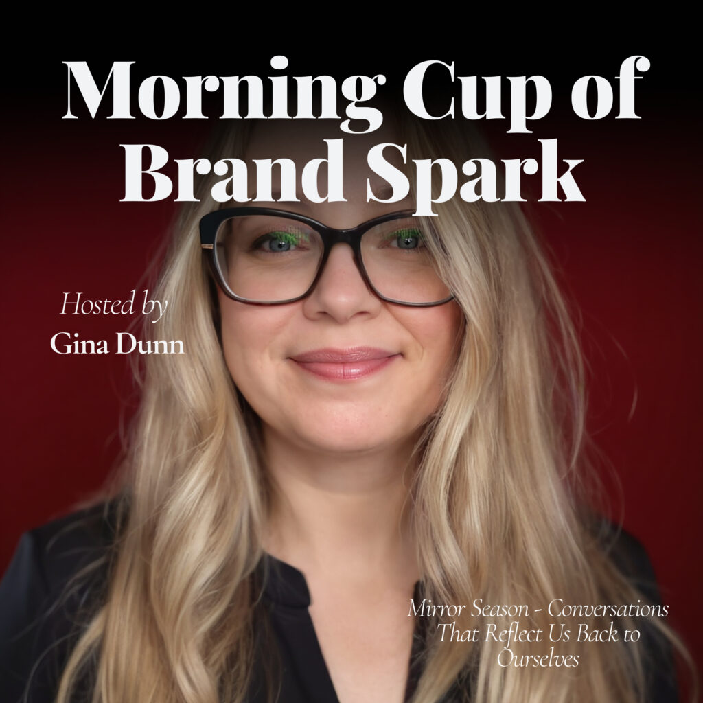
Episode 66: Brand Dissonance — When the Visuals and the Voice Don’t Match.
Ever feel like your brand looks one way but feels another? That’s brand dissonance. And it’s a trust-killer.
Today’s Brand Spark explores how to close the gap between your visuals and your voice — and what to do when they don’t match.
Rebuild from alignment, not aesthetic: https://ogsolutions.nl/brand-glow-up-audit/
"If your brand looks better than it sounds, it's not aligned, it's a costume."
Full transcript
Ever feel like your brand looks one way but feels another? That's brand dissonance, and it's a trust killer. Today's BrandSpark explores how to close the gap between your visuals and your voice, and what to do when they just don't match. Rebuild from alignment and not from aesthetic. Good morning. You're listening to Morning Cup of BrandSpark, and I'm Gina Dunn, founder of OG Solutions.
and the one who helps you sound as strong as you are. Today is Friday, July 4th. And let's begin with this. If your brand looks better than it sounds, it's not aligned, it's a costume. So let's spark it up. So first let's talk about the visual voice disconnect. I've seen it a hundred times. You've got a sleek website. You've got an on-trend design.
You've got these super cool gradient overlays and custom icons. Maybe you had a photo shoot, but then I hit your about page or I hop on your Instagram and I read your latest post caption or I hear you on a podcast and the tone, it falls flat. It's either too vague, too generic, overwritten, or it just doesn't sound like the you that I know. And that disconnect is called brand.
dissonance and it erodes trust even if they can't explain why it does. Because humans, we know when something's off, even if it's really subtle, even if people just can't name it.
And that's where the gap starts. Brand dissonance starts when design leads strategy. You make something super beautiful before you know what it's supposed to say. You launch a visual identity before a real messaging system. You copy, paste lines from other industries. You work with a designer, but you never actually define your voice. You launch a kick-ass website, but you haven't defined your why.
When your brand doesn't sound like you, your audience stops believing that it is you. They may compliment your colors or your website or your design or your look. They might follow you. But you know what? They're not going to buy from you. Because it doesn't feel safe to them.
So you need to align design to voice, not the other way around. Here's the shift. Don't design and then try to write. Write first. Define your strategy first. Know what you stand for, how you speak, and why it really matters to you. Then, and only then, build a design system that amplifies that truth. Visual should feel like your voice in color and shape.
not a layer of polish to hide behind. And when your visuals and your voice are aligned, your message lands faster. You sell more smoothly. And you feel more confident showing up as you because it all feels like you. So here's your spark check for today. Where in your brand does the tone feel off? Spark two. What part of your visual identity doesn't match how you speak?
in real life. And Spark 3. Have you ever delayed a decision because your brand didn't feel like your own? You guys, brand dissonance is common. And fixing it starts with you, your voice. Start with alignment. If you need some help to recalibrate it in real time, you can hit me up for a brand clarity session. Design should amplify your voice. Never cover it up.
So that's your brand spark for today. I'll see you tomorrow.
Key takeaways & FAQ
Five things to steal
- 01 Write your brand voice and messaging strategy before designing anything visual.
- 02 Brand dissonance erodes trust even when audiences cannot consciously identify why.
- 03 Compliments on visuals do not convert — misaligned brands feel unsafe to buy from.
- 04 Visual identity should feel like your voice expressed in color and shape.
- 05 Alignment between visuals and voice makes selling smoother and showing up easier.
Frequently asked
Brand dissonance happens when your visual identity and your brand voice don't match — your design looks polished but your copy falls flat, sounds generic, or simply doesn't sound like you. According to Gina Dunn, this erodes trust even when audiences can't explicitly explain why, because humans instinctively sense when something is off. The result is that people may admire your design but won't buy, because it doesn't feel safe.
Gina Dunn recommends reversing the typical process: define your messaging strategy first, clarify what you stand for and how you speak, and then build a design system that amplifies that truth. Visual elements should feel like your voice expressed in color and shape — not a layer of polish used to hide behind. Starting with alignment rather than aesthetics closes the gap.
Brand dissonance typically starts when design leads strategy. Common causes include creating a visual identity before establishing a real messaging system, copying language from other industries, working with a designer without defining your voice, and launching a website before clarifying your brand's core 'why.' The result is a beautiful brand that sounds nothing like the person or business behind it.
Gina Dunn suggests three self-audit questions: Where in your brand does the tone feel off? What part of your visual identity doesn't match how you actually speak in real life? And have you ever delayed a business decision because your brand didn't feel like your own? If any of these resonate, brand dissonance is likely present and recalibration starting with your voice is the recommended fix.
Liked this episode? Get my weekly semi-regular newsletter on brand and positioning.
One short read every few weeks. Just the sharpest thinking from the period, from me to you, in under five minutes.