
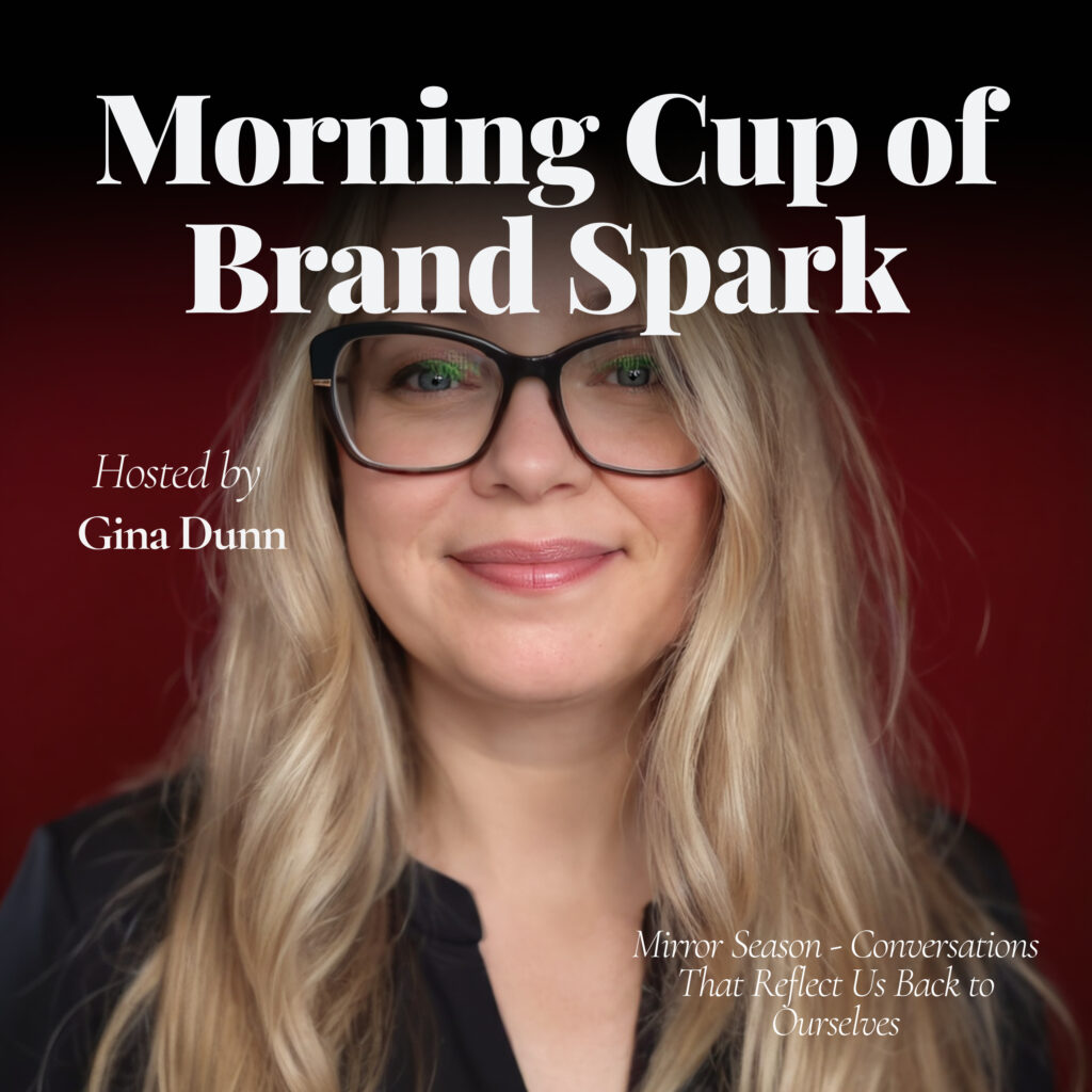
EP37: June 5, 2025 – Your Message ≠ Your Fonts
Fonts can’t fix fuzzy messaging. Today’s spark is a reality check for all of us who’ve been stuck in the design trap. Let’s talk about why your words matter more than your typography.
Discover more:
👉 Take the Brand Glow-Up Audit Toolkit — and get clarity on what’s working, what’s not, and what to fix first. [click here]
🧠 Find your biggest brand gap: What’s Your Brand Blocker? Quiz — fast, free, freakishly accurate. [click here]
🎙️ Like spicy marketing convos with AI + bold branding? Tune into my video podcast with Natalie: BrandedAF → [click here]
📬 Get my juiciest takes every month in the Brandology LinkedIn Newsletter — follow here → [click here]
💬 DM me your spark from today’s episode — I read every single one. Seriously.
🤝 Let’s connect on LinkedIn — drop me a note and tell me what you’re building → [click here]
🚨 Feeling stuck or scattered? Book a 1:1 Clarity Call with me — we’ll find your brand’s backbone and make it work smarter. [click here]
"Your fonts can make it pretty, but only your voice can make it truly powerful."
Full transcript
Fonts can't fix fuzzy messaging. Today's spark is a reality check for all of us who've been stuck in the design trap. Let's talk about why your words matter much more than your typography. Welcome back to Morning Cup of Brand Spark. Today is Thursday, June 5th, and I'm Gina Dunn, founder of OG Solutions. Today's spark is one I know way too well, the difference between fonts and messaging. So let's spark it up.
Here's the truth. I've changed my brand font more times than I can even tell you over the years. Paid fonts, free fonts, fancy as F fonts, simple fonts, clean fonts, I've done them all actually. And every time I thought, well, this would be the last thing that makes my brand feel right or look right. This is going to fix it. But you know what? It didn't fix a thing because my real problem wasn't the font.
It was that I hadn't nailed down what the heck I was actually trying to say. I was tweaking the visuals to avoid doing the real work of getting my story and my core completely right. And every single time, it was a massive waste of my time. The minute that I got clear on what I stood for, who I was speaking to, and what I was here to say, the font decision and justification got way easier.
And it became the cherry on top and not the main course. And even more once I dug into my brand strategy and got my brand archetype blend right. So this is what I see in so many founders. They're stuck in the design loop thinking. If I just pick the perfect font, it'll finally feel right or feel real. But the font isn't the soul of your business. The message is.
Because your fonts, they're just the container. Your message, that's what moves the people. So here's your spark today. Your message is your magnet. Your fonts are just the frame. If you're stuck, keep this in mind. Sure, your fonts can make it pretty, but only your voice can make it truly powerful.
So here's your three Spark checkpoints today. Spark one, when's the last time you spent more time on your visuals than your voice? And Spark two, what's the one core message that you want your brand to own no matter what it looks like? And Spark three, if you had to tell your story out loud right now, what would it sound like?
What would your brand sound like?
So that's your spark for today. Your brand isn't your fonts, it's the words and it's the truth behind the words. So here's my challenge for you. Today, share one real raw sentence about your work on LinkedIn or Instagram, if that's your channel. No fancy visuals, just your voice. One real sentence. Tag me.
On Instagram, I'm BrandwithGina and on LinkedIn, I'm my name Gina Dunn. Tag me there. I wanna see what you're really about, the real you. And if you're craving some spicy marketing truths and messy brand talk, if you didn't know, I have a second podcast that I do with my business bestie Natalie. It's called Branded AF Podcast. And on this podcast, it's a little bit different. It's a video podcast.
And we're talking about all of it and we don't hold back explicit language and all. So you can follow that podcast on YouTube or on Spotify or on Apple podcasts everywhere, but it's video and it's new episodes are dropping every two weeks. And we've got a private LinkedIn group there if you want to join the fun as well. So that's it for today. I'll catch you tomorrow.
Key takeaways & FAQ
Five things to steal
- 01 Fonts are just the container; your message is what actually moves people.
- 02 Tweaking visuals is often a way to avoid doing real brand messaging work.
- 03 Nail your core story and target audience before making any design decisions.
- 04 Brand archetype clarity makes font and visual choices significantly easier and faster.
- 05 Publishing one raw, honest sentence beats polished visuals with no real voice.
Frequently asked
According to Gina Dunn, changing fonts repeatedly is a symptom of not having nailed your core message. The font is just a container — it can make things look pretty, but it cannot fix unclear brand messaging. Until you get clear on what you stand for, who you're speaking to, and what you're here to say, no font choice will make your brand feel right.
Gina Dunn recommends getting your brand strategy and core message locked in first — specifically your brand archetype blend, your story, and who you're speaking to. Once that clarity is in place, visual decisions like fonts become much easier and fall into a supporting role rather than carrying the weight of the entire brand identity.
Gina Dunn frames it this way: your fonts are the frame, your message is the magnet. Design elements like fonts can make a brand look appealing, but only your voice and the truth behind your words can make it powerful and connect with people on a deeper level. Messaging is the soul; design is the surface.
Gina Dunn describes the design loop as spending more time on visuals than on your actual voice and story. Key signs include repeatedly changing fonts or visual elements hoping it will finally make the brand feel real, while avoiding the harder work of defining your core message, your audience, and the story you want your brand to own.
Liked this episode? Get my weekly semi-regular newsletter on brand and positioning.
One short read every few weeks. Just the sharpest thinking from the period, from me to you, in under five minutes.